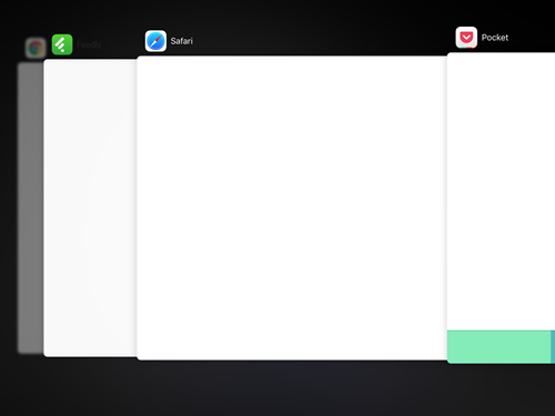
Fore some reason, the app switcher in iOS 9 has changed direction: The most recent app is shown in front and the older apps are shown stacked behind each other towards the left, as shown in the image below:
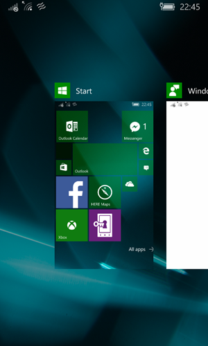
This has also been the norm on Windows Phone and it’s app switcher: the older apps are shown to the left, with the most recent rightmost in the list, as shown here:

I believe this to be the right order to sort apps. It makes more sense to most of the western world. We read from left to right and progression is associated with left to right movement.
If you observe in films, you’ll see that the journey (or progressing travels) happen from left to right on the screen. Going from right to left however symbolises the journey home (or something going backwards).
In my mind sorting the apps from most recent to the right, and the least recent to the left, shows the users digital journey through apps. If they want to find an app they’ve used in the past, “travel” to the left and find it, just as you would find something previously read in a book to the left.
That’s why I am confused as to why Microsoft has changed the direction of the app switcher in Windows 10 Mobile to the one iOS had before:
Windows 10 Mobile is still not done, and they may change it, but it seems like a bit of a backwards step. There is however one positive thing to say about the change: it easier to reach the previous app if you’re holding the phone in your right hand. (Which should be a win for all those who don’t like navigation to be in the top left corner.)