CSS grids are the new kid on the block when it comes to laying out elements on a web page. I'm not going to explain how it's different from Flexbox, but I am going to show you one feature that's more easily done with CSS grid than Flexbox.
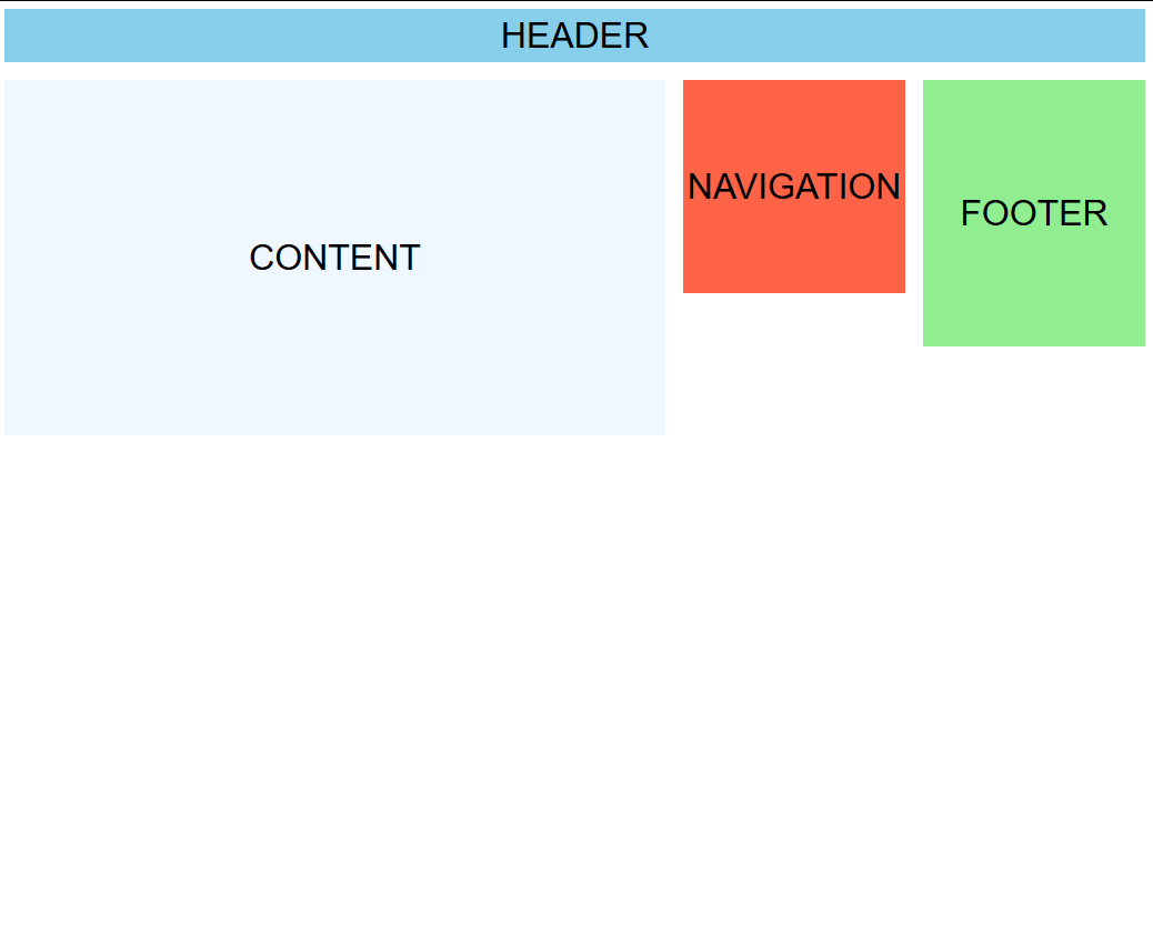
Imagine you want to create a layout that works like this, but don't want to rely on JavaScript:
This is possible using CSS grid.
Let's start with some simple HTML:
<div id="container">
  <header>
    HEADER
  </header>

  <nav>
    NAVIGATION
  </nav>

  <main>
    CONTENT
  </main>

  <footer>
    FOOTER
  </footer>
</div>
This should be some pretty straight forward stuff. We have div container to hold the four elements which will be moved around. Let's start with the interesting stuff - the CSS.
first some boilerplate:
header, nav, main, footer {
  font-size: 2rem;
  font-family: sans-serif;
  display: flex;
  justify-content: center;
  align-items: center;
}

header {
  background: skyblue;
  height: 3rem;
}

nav {
  background: tomato;
  height: 12rem;
}

main {
  background: aliceblue;
  height: 20rem;
}

footer {
  background: lightgreen;
  height: 15rem;
}
This is just some styling to set some background colors, make the text easily distinguishable and center it. Now we've got this result:

We add display: grid to the #container to make it show its child elements as grid items:
#container {
  display: grid;
}
There's no difference in the display of the elements. Grid has the default behavior of stacking the elements in a single column:
Our layout has three columns. To define three columns we use the grid-template-columns property. You define a number of space-separated values, and each value represents the width of a column in your grid:
grid-template-columns: 1fr 200px 200px;
Here we've defined three columns with the specified widths. The two last values should be pretty self explanatory, but the first is new. The fr unit (short for fraction) represents the remaining space. 1fr means 1 part of the remaining space. You can read up on the fr unit over at CSS-tricks.
The result looks like this:
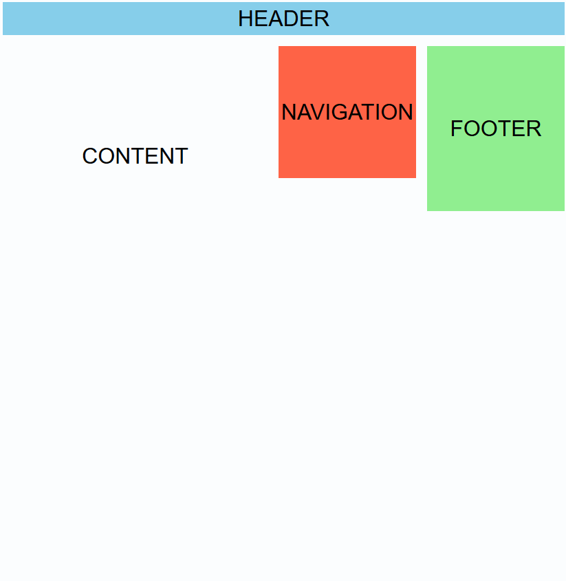
While we have three columns, the elements are not arranged as we'd like them. By default, CSS grid will arrange one element into each column and jump one row down when it runs out of columns. The row height is set equal to the tallest element in the row. This is commonly referred to as wrapping the elements.
We will want to define how the elements are arranged in the grid. There are multiple ways of doing this, but I prefer to define areas in the grid and tell the grid how to arrange the areas.
First we need to define the different areas. This is done with the grid-area property and it's put on the child elements. You define an element as a grid area by giving it a name:
// In header style
  grid-area: header;

// In nav style
  grid-area: navigation;

// In main style
  grid-area: content;

// In footer style
  grid-area: footer;
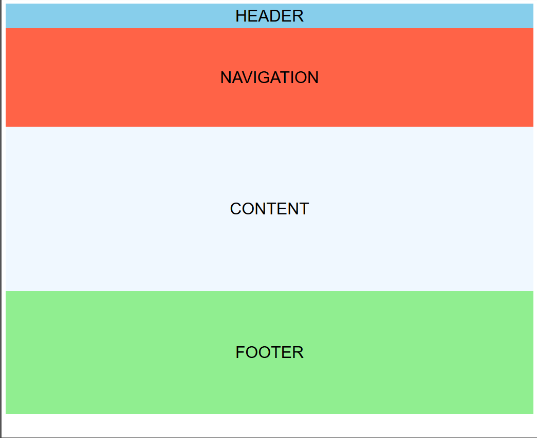
I've set the names of the elements to be the same as the text inside them. The result is now this:

This is not what we want at all! All the elements are stacked on top of eachother. We'll need to define how to arrange the areas inside the grid. This is done with the grid-template-areas on the #container itself:
grid-template-areas:
  "header header header"
  "content navigation footer";
We are defining two rows (one for each "string"). Inside the row definitions we define which area should occupy which column(s). We use the names of the areas which we defined earlier.
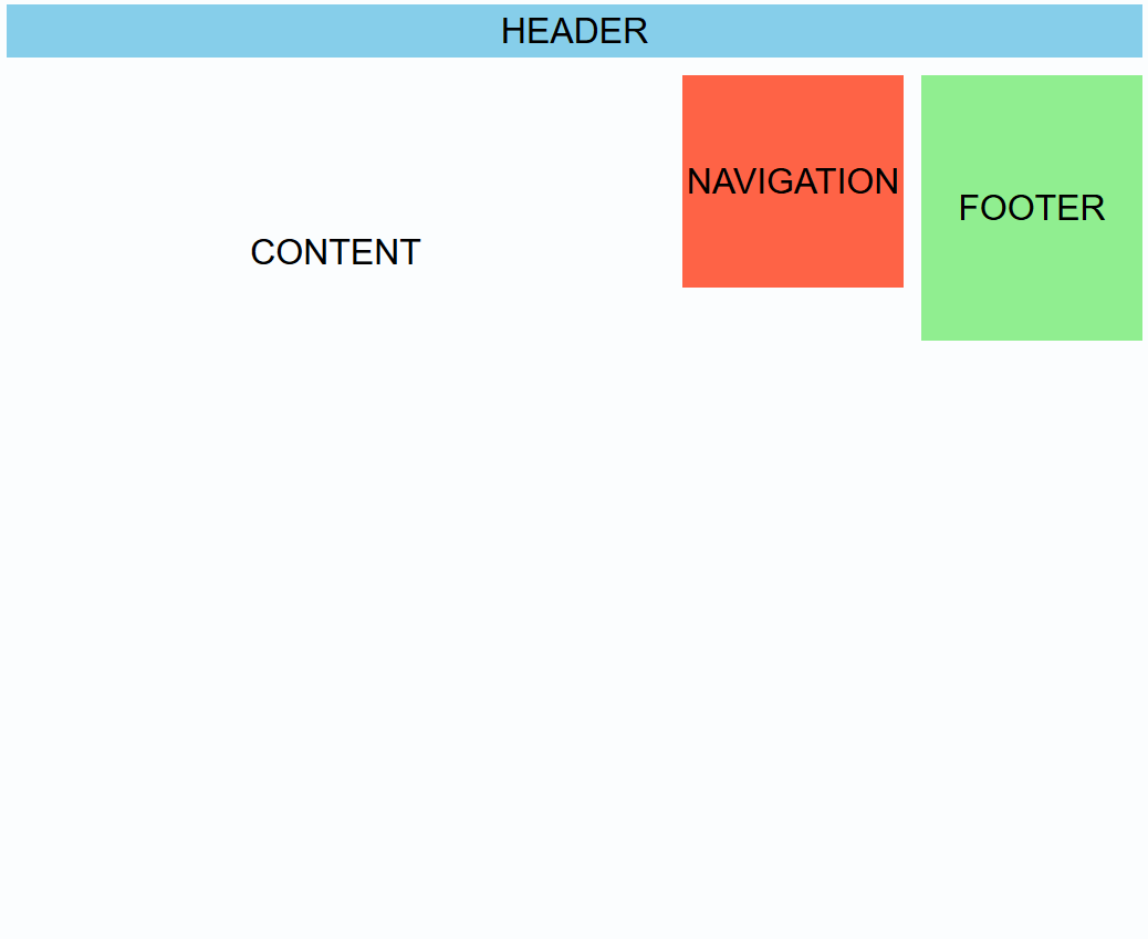
We specifically say that header should span across all 3 columns in the first row. content, navigation and footer should each occupy one column each on the second row.
We now have the following:
This looks more like what we want. Let's add a little spacing to between the elements to make it feel less cramped. We can use the grid-gap property to do this. We set it on the #container:
grid-gap: 1rem;
This sets the gap between elements to one rem. We now have this result:
Did you notice how easy it was to create gutters (as they're called in Bootstrap, et al.)?
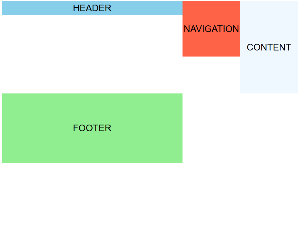
We're almost done, but there's one thing that's missing. Responsiveness. If we resize the page now, it will not rearrange at all:
This can be fixed with some @media queries:
@media (max-width: 800px) {
  #container {
    grid-template-columns: 1fr 200px;
    grid-template-areas:
      "header header"
      "content navigation"
      "footer footer";
    }
}

@media (max-width: 600px) {
  #container {
    grid-template-columns: 1fr;
    grid-template-areas:
      "header"
      "navigation"
      "content"
      "footer";
  }
}
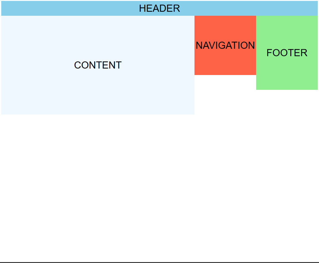
The only things we change at the lower screen widths is how many columns the grid has and how the areas are distributed. We now get the desired result:

You can see the result here:
See the Pen Responsive CSS grid pt 1 - Finished by Jon Stødle (@jonstodle) on CodePen.
Happy coding!