In the previous part we made a responsive layout using grid areas. With grid areas, it's possible to arrange parts of the layout in a grid and rearrange quite easily with media queries.
In this part we're going to look at another feature of CSS grid which helps you build a reponsive layout: auto-fill and auto-fit. These keywords values can be used as values when defining column widths in a CSS grid.
They have very similar names and behave very similarly, they do slightly different things. I'll try to explain this to you here.
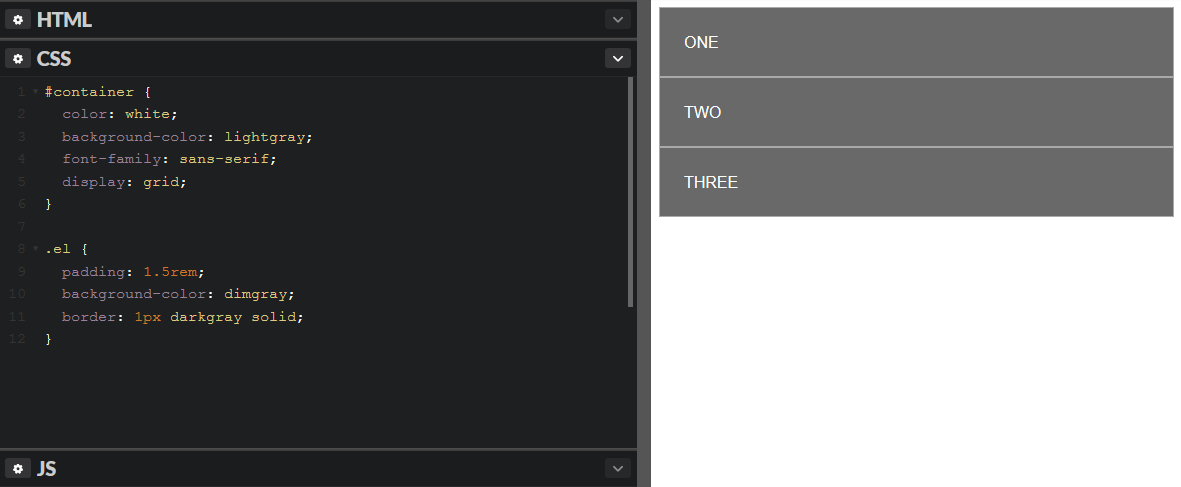
We start off with some simple HTML and CSS:
<div id="container">
  <div class="el">ONE</div>
  <div class="el">TWO</div>
  <div class="el">THREE</div>
</div>
#container {
  color: white;
  background-color: lightgray;
  font-family: sans-serif;
  display: grid;
}

.el {
  padding: 1.5rem;
  background-color: dimgray;
  border: 1px darkgray solid;
}
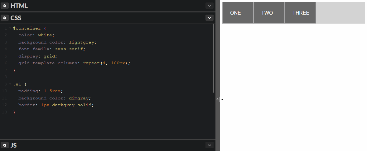
Next we're going to use the repeat() CSS function. repeat() let's you define a lot of columns or rows (using grid-template-columns and grid-template-rows) in succinct way. The first parameter is the number of times to repeat and the second parameter is what to repeat:
grid-template-columns: repeat(4, 100px); // Repeat 100px four times
auto-fill and auto-fit lets you create more dynamic layouts:
auto-fill
Instead of repeating a width multiple to create a set number of columns, we can instead tell the browser to fit as many columns as possible given the specified length.
auto-fill says "automatically fill the row with as many columns as possible given this width". auto-fill is used in conjunction with repeat() like this:
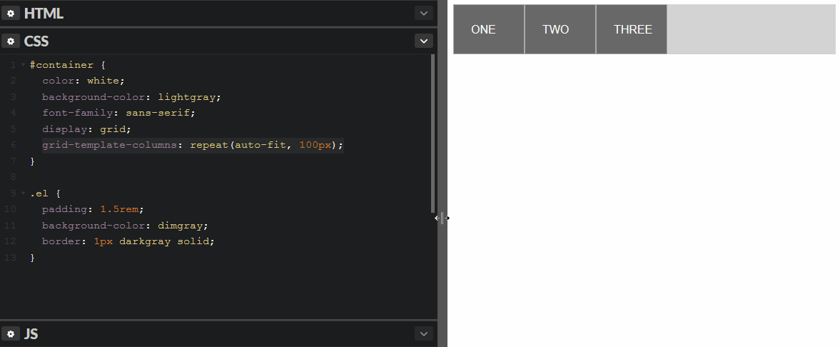
grid-template-columns: repeat(auto-fill, 100px);
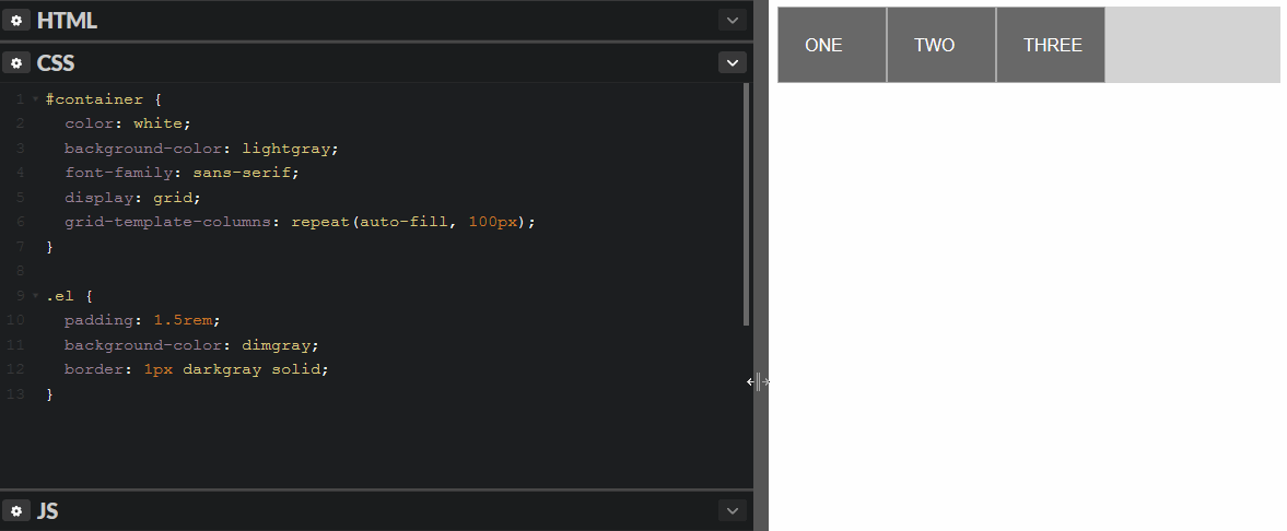
As you can see, each row is filled with as many columns are possible given the specified width (100px). When there's no space left on the row, it will start putting elements on the next row.
minmax
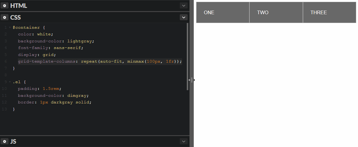
minmax() is a CSS function which is very handy in conjunction with auto-fill. It let's you specify a minimum and maximum value at the same time. If we specify that we want the columns to be minimum 100px and a maximum of 1fr (the rest of the available space), the columns will auto size to fill the row:
grid-template-columns: repeat(auto-fill, minmax(100px, 1fr));
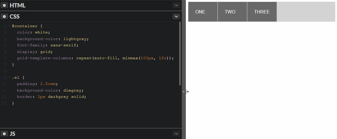
The browser will now fit as many columns with a minimum width of 100px as it can. If there are any space left over on the row, that space is divided equally among all the columns.
auto-fit
Let's swap out auto-fill with auto-fit in the first auto-fill example:
grid-template-columns: repeat(auto-fit, 100px);
Not much difference here compared to auto-fill. The difference becomes apparent when you instruct the browser how to handle the left over space in the row.
minmax
Let's add a minmax() again:
grid-template-columns: repeat(auto-fit, minmax(100px, 1fr));
auto-fit will behave mostly like auto-fill, but if there's only one row and there's space for more columns, but no elements to put in those columns, it will make the width of the empty columns 0. Makin the max width of the columns 1fr, will make the browser divide the left over space equally between them.
You can play around with the setup in this Codepen:
See the Pen Responsive CSS grid pt 2 by Jon Stødle (@jonstodle) on CodePen.
I hope i've helped you understand auto-fill and auto-fit a little better.
Happy coding!